
Interactive: Natural Disasters Around the World Since 1900

Interactive: Natural Disasters Around the World Since 1900

By Our World in Data-
While natural disasters are inevitable and commonplace within the context of human history, that doesn’t lessen our collective shock when they occur.
Here are just a few of the natural disasters that made headlines last year:
- Haiti was rocked by a 7.2 magnitude earthquake that killed more than 2,000 people Tens of thousands of homes were damaged or destroyed.
- Super typhoon, Rai, killed 375 people in the Philippines. The storm brought winds as high as 120 mph (193 kph)
- Landslides in China’s Henan province kill more than 300 people
- Historic flooding results in more than 200 fatalities in Germany and Belgium
- Hurricane Ida battered the Gulf Coast, killing 91 people across nine U.S. states
And these are just some of the many events that rounded out a long list of disasters in 2021.
The interactive dashboard above was created by Our World in Data, using data came from EM-DAT, the International Disaster Database. The database aims to rationalize decision making for disaster preparedness and to provide an objective base for vulnerability assessment.
Total Deaths by Natural Disaster in the Last Decade (2010-2019)
In the past decade, approximately 60,000 people per year died from natural disasters. This represents 0.1% of total deaths worldwide.
The chart below breaks down the total deaths by type of natural disaster in the last decade.
| Type of Natural Disaster | Total Deaths (2010-2019) |
|---|---|
| Earthquakes | 267,480 |
| Extreme Temperatures | 74,244 |
| Floods | 50,673 |
| Storms | 27,632 |
| Droughts | 20,120 |
| Landslides | 10,109 |
| Volcanic Activity | 1,363 |
| Wildfires | 881 |
| Mass Movement | 100 |
| TOTAL | 452,602 |
Historically, droughts and floods were the most fatal natural disasters.
However, deaths from these events are relatively low now compared to earthquakes, which are by far the most deadly natural disaster in modern times. Over the past decade, earthquakes have killed 267,480 people worldwide, followed by extreme temperatures, which killed 74,244.
The Decline of Deaths from Natural Disasters
Is planet Earth really more dangerous than ever? Let’s take a look at what the data says:
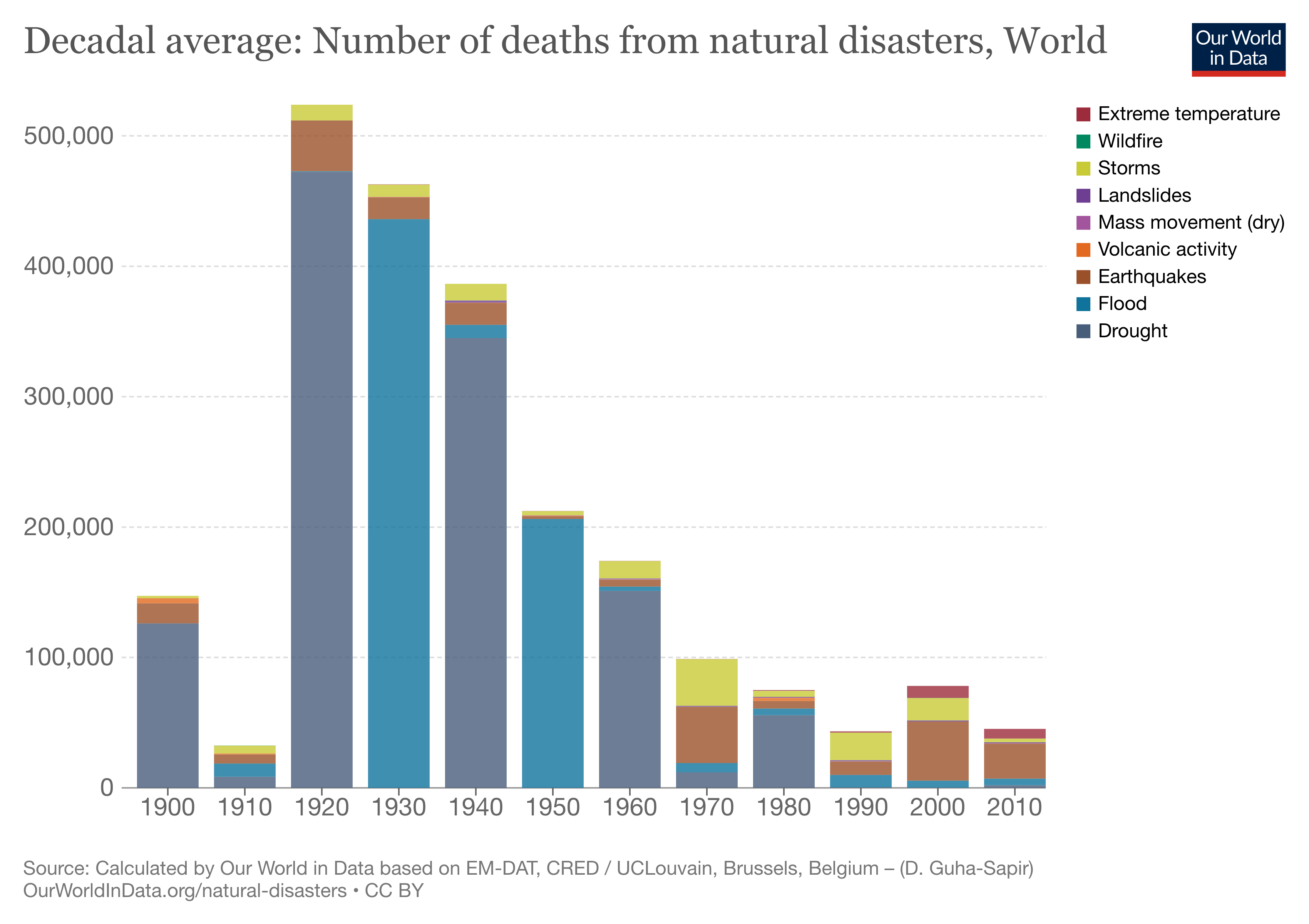
The chart above shows a sharp decline in deaths from natural disasters over the last 100 years.
In the 1920s, the world averaged over 500,000 deaths from natural disasters per year. These were caused by several outlier events: for example, a Tokyo earthquake in 1923 killed over 146,000 people, and drought and famine killed 3 million people in China between 1928 and 1930.
In the 1930s, the number dropped below the 500,000 deaths per year average, but a number of events still put their thumb on the scale. In 1931, floods in China killed over 3.7 million people, and in 1935, an earthquake killed up to 60,000 people in Pakistan, and so on.
But luckily over time, the decadal average has dropped to fewer than 100,000 deaths per year. And if we consider the rate of population growth, then the decline over the past century has been even more dramatic.
Our awareness of natural disasters has increased dramatically along with global access to real-time information, and thankfully, these occurrences are less deadly than they once were.
How to Navigate this Interactive Visualization
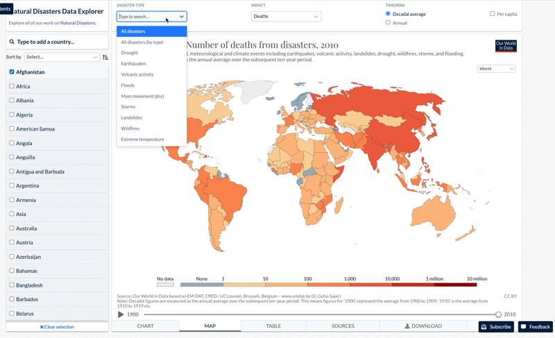
The dashboard above is packed with useful views and data. Some of the features to highlight are:
The Top Navigation
– Type of disaster: The options include: drought, earthquakes, floods, storms, volcanoes, extreme temperatures
– Impact: The impact of the natural disaster is measured in: deaths, injuries, affected, homeless, and more
– Timespan: The selection allows for average by decade and year
– Per capita: The impact is measured in per capita terms instead of total numbers
The Left Bar
– Filter the data by country and region
– Filter the data by type of disaster and related effects (e.g. deaths, economic impacts)
The Bottom Tabs
– Bar Chart: All data selected is displayed in a bar chart format
– Map: Data is shown by country in a heat map. Click “Play” at the bottom left to view data for different decades
– Table: The same data that is displayed in the visualization is shown in table format
– Sources: All the data sources and calculations are clearly displayed in this tab
– Download: This option allows downloading the image in PNG, SVG, and full data in CSV
No comments:
Post a Comment
Note: only a member of this blog may post a comment.